Versions Compared
| Version | Old Version 6 | New Version 7 |
|---|---|---|
| Changes made by | ||
| Saved on |
Key
- This line was added.
- This line was removed.
- Formatting was changed.
| Tip |
|---|
Displays are components of the application that serve as an interface between the user and the monitored process. Each can be formed by multiple static or dynamic parts (or Displays). One Layout defines the size of the application window and the basic arrangement of visualization components. |
Displays Selection and Creation
However Action.NET the main window of the application Display is defined by an object named Layout. One Layout defines the size of the application window and the basic arrangement of preview components (Displays and Display parts) in the application in real time. See "Layout Creation".
A Display can contain multiple visualization and command elements, including controls, data Display areas, static areas, and other objects. These components or Displays can be static, that is, they are always displayed, such as a menu bar, toolbar, or status bar. Components can also be swapped dynamically, depending on what the user clicks or selects.
To select Displays:
Go to Edit> Displays> Displays.
Select the viewing option Cardview or TableView at the top right of the DataGrid with the List of Displays.
See the list of available Displays appear on datagrid.
Column | Description |
Name | Display name configured when creating the Display in the environment Draw. You can rename the Display by simply re-typing the new name over the current text. |
Mode | Read-only. Configured when setting the Display in the environment Draw. |
Preview | Read-only. Shows a thumbnail figure of the Display. |
AllowSelection | Select to allow users to select the Display through the page selector (PageSelector). |
EditSecurity | Choose which permissions users must have to have access to edit this Display. |
RunSecurity | Choose which permissions users need to have to have access to this Display at run time. |
Description | Enter a description for this Display. |
Other columns not included in the table above refer to the Display dimensions. In this table these attributes are in read-only mode. Can be changed in the environment Draw described below.

Display Operations
To edit a Display, select it from the DataGrid tab Display and press the DRAW button.

When you are in the DRAW environment, you can also edit Displays by selecting them in the combo-box in the toolbar that appears to perform operations with the Displays.

The left box shows the name of the Display currently loaded on the desktop. Opening this box (click the arrow) appears the list with all existing Displays in the project. By choosing one from the list, it will load into the Drawing area and become the current Display for editing.
The floppy icon is used to request saving of changes;
The icon with the floppy and the figure opening the plug is used to request saving the Display with another name (save as).
The icon with the + sign should be used to create a new, empty, and close Display, saving it to the Display until then loaded. It also causes a window to appear asking for the name to be given to the new Display.
The symbol with Video Monitor lets you show a preview of the Display to see what the Display will look like in real time.
The icon with the image of a data window, when pressed, shows a window with the list of all existing objects on the Display. By clicking on each of the listed objects, select the object on the Display.

The last icon is used to close the current Display without saving the last changes
Creating a new Display
To create a new Display
Go to Draw> Draw .
Click the icon whose action is Close the Current Display and Create a new one.
 Image Modified
If you don't see this button in the toolbar, make your window wider.
The window appears to create a new Display.
 Image Modified
Enter or select the information as needed.
Column | Description |
Display Name | Enter a name for the Display. |
Description | Enter a description for the Display. |
Level | Choose a Level (Asset) for this Display optionally |
.NET Smart Client | Select this option for Displays to be displayed normally on Action.NET |
Dashboard | If you want to create the Display in the format for dashboard presentation, mark the comic. |
HTML5 Client | Select this Display to work in the HTML5 pattern. |
native iPad/iPhone | Note: If you plan to use this Display for iPad and iPhone users, be sure to select this option when creating the display. You can't change it later.
|
Default View: | Select the default Display mode for iPad and iPhone users:
|
Click OK, to close the Display creation window.
| Note |
|---|
NOTICE: If the Display is for use with an iPad or iPhone, you must select the |
Setting properties for the common Display

On the left side of the main window appears an area for detailing the attributes of the Display, with two parts: Appearance and DisplaySettings.
The parameters of Appearance define the style of the "brush" used when drawing objects on the Display, including colors.
Clicking on the option Fill (fill) you can set Colors, gradients, or objects to fill a graphic figure.
The parameters in DisplaySettings define, the attributes of the Display. Displays can be configured as PopUps, Dialogs, or Normal Displays. The dimensions of the Display when created follow what is defined in Info>Settings.
Like any graphic object, Displays can have different colors and patterns, borders, titles, and more.
A special feature is that you can specify an animation transition to use when switching from one Display to another in a similar way to what you use in PowerPoint presentations.
If you have selected the Display option for iPad/iPhone iOS, when you created the view, not all DisplaySettings will be available. Also in the case of Dashboards there will be some differences for definition. See the following items.
At the bottom you can choose Enable Theme, for use of this color-swapping functionality of presentation themes.
For setting Display properties:
Enter or select the information as needed for setting displaysettings
Column | Description |
Mode | Select the type of Display you want to create:
|
Background | Select the background color of the Display. |
Width | Enter the Display width in Monitor-independent (WPF) units. Be sure to take into account the size of the layout.. When created it receives the width set in Info>Settings. |
Height | Enter the Display width in Monitor-independent (WPF) units. Be sure to take into account the size of the layout. When created you receive the height set in Info>Settings. |
Border | Select the border type of the Display. |
CloseButton | Select whether to display the Close button of the Display. Available only for Popups and dialogues. |
Animation | Select the type of animation (None, fade, slide, scroll) to use when showing this Display.. |
Show on PageSelector Object | Check the option to include this Display In Display Selector that allows users to directly access a Display in the app, without having to include navigation buttons on the Displays. |
iPad/iPhone iOS target | Read-only. Shows whether you selected the Display option to be used on iPad/iPhone iOS when you created the Display. |
Placement | Select where, within the Layout, you want to place this Display. Available only for Popups and dialogues. |
Target | Select whether the "Placement" set is relative to the mouse position or relative to the entire window. Available only for Popups and dialogues. |
DialogButtons | Select the control buttons you want in the dialog box. Available for dialogue only. |
Title | Enter a title that will appear at the top of the Display. |
Title Background | Select a color for the background of the title. |
Stays Open on Page Change | Leave the pop-up window open when the user clicks on something that opens a different Display. Available only |
Stays Open After Losing Focus | Leave the pop-up window open when the user clicks on another one. Display. Available for Popups only. |
Left | Type, the distance between the left margin of the Layout and the position at which the left side of the Display should appear, in Monitor-independent pixels (WPF) units. Available only for Canvas Layouts. |
Top | Type, the distance between the top of the Layout and the position at which the top of the Display should appear, in Monitor-independent pixels (WPF) units. Available only for Canvas Layouts. |
Use the drawing tools on the vertical bars on the left and bottom horizontal to create, and position viewing objects on the Display
Select one of the buttons on the vertical toolbar. Place the cursor in the display area, then click and hold the left mouse button while dragging the cursor in the area of the newly created Display.
To see an options menu, right-click on the drawn object. The context menu provides actions that are specific to the selected object.
To select multiple objects, press Shift + Left-click on each object.
The horizontal toolbar (at the bottom of the Drawing) contains buttons to group, combine, align, and lock selected objects
For more information on drawing tools, see "Drawing tools" .
Click Save Display.
| Note |
|---|
WARNING - When selecting multiple objects, the last object selected is the "master": its properties are those shown in the left pane. If you then align the objects, the alignment is based on the master. If you change other properties, the properties change for all selected objects. |
Dashboards
Dashboards quickly transmit a large amount of data in a compact and easily accessible format.
Responsive layouts allow your dashboards to be intelligently resized based on the Display size of the viewing device.
Drag and drop panels easily to display various chart types, such as trend, pie, bars, plus gauges, and more!
Add any object from the symbol library - whether it's native to Action˳NET or a user-created one!
Create groups to control your responsive behavior separately from the general page.
Create dashboards for .NET and HTML5 clients from the same development environment.
Support our new Project Themes for quick customization!
Setting properties for Dashboards Displays

For type Displays Dashboard, due to its functionality, few properties should be set. Basically the background color, Display size and whether to use the functionality of color themes.
Only Symbols, (local library or graphic symbol library) WPF components (charts, tables, grids, other controls) and panels can be inserted into dashboard-type Displays.
You can't draw directly at the bottom of the Display. For a drawing, label objects, or numeors displays or text, make a symbol and colloquial these elements on it. After place the symbol on the Display. These symbols or components will always be wrapped by containers that will be responsively resized in real time.
See more details of how to use this Displays in Dashboards.
Display Opening Methods
There are many ways to open a new Display or Popup. For each method, specific characteristics must be considered. Below you will find every method for opening a new Display with some description on their behavior and how to use them.
Display.DisplayName.Open
Begin Open Display process
Returns a flag (true or false) indicating success or fail
Uses the following syntax:
|
Display.DisplayName.OpenModal
Open Display as Modal
Not available for Mono and HTML5
Returns a flag (true or false) indicating success or fail
Uses the following syntax:
|
Display.DisplayName.NewPopup
Open a new popup. If the Display is already open, a new instance will open
Always returns an empty string, independent if it succeeds or fails
Uses the following syntax:
|
Client.OpenDisplay
Open a Display
Returns a flag (true or false) indicating success or fail
Uses the following syntax:
|
Client.OpenDisplayAtIndex
Open Display at x-order list of displays. Current Display is closed
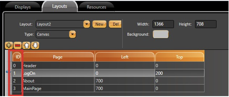
Returns a flag (true or false) indicating success or fail
Uses the following syntax:
|
Client.NewPopup
Open a new popup. If the Display is already open, a new instance will open
Always returns an empty string, independent if it succeeds or fails
Uses the following syntax:
|
Display Namespace
With most systems, you must create custom logic for your projects and create Tags or Variables for all internal properties. Namespaces allow your application to directly access all the objects that you created in your project.
This means that user-created temporary tags are not required to manage the status of PLC network nodes, the total number of alarms in a group, or the number of rows in a dataset. You can now access runtime objects, business objects (representing a network node), or an alarm group or dataset. Then, you can display the required information or take action directly through the object's built-in properties.
When you are building a project's configuration, filling input fields, or creating scripts, the system uses Intellisense auto-completion to guide you to all the existing properties that you are allowed to use according to what you are editing. This feature allows you to easily ‘drill down’ to a specific property.
When accessing a project object in the .NET Script Editor, it is necessary to prefix the namespace with an ‘@’ symbol in order to avoid conflict with the .NET local variables names.
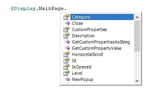
Below you will find a list of the Display namespace's properties and methods and some properties from the Client namespace.
Display Namespace
Properties
Category: ReadOnly property with categories that are configured for the Display Object in Run > Dictionaries > Categories. Used for organization purposes.
Description: Description of the display, configured in Edit > Displays > Displays.

HorizontalScroll: Indicates the horizontal scroll value.
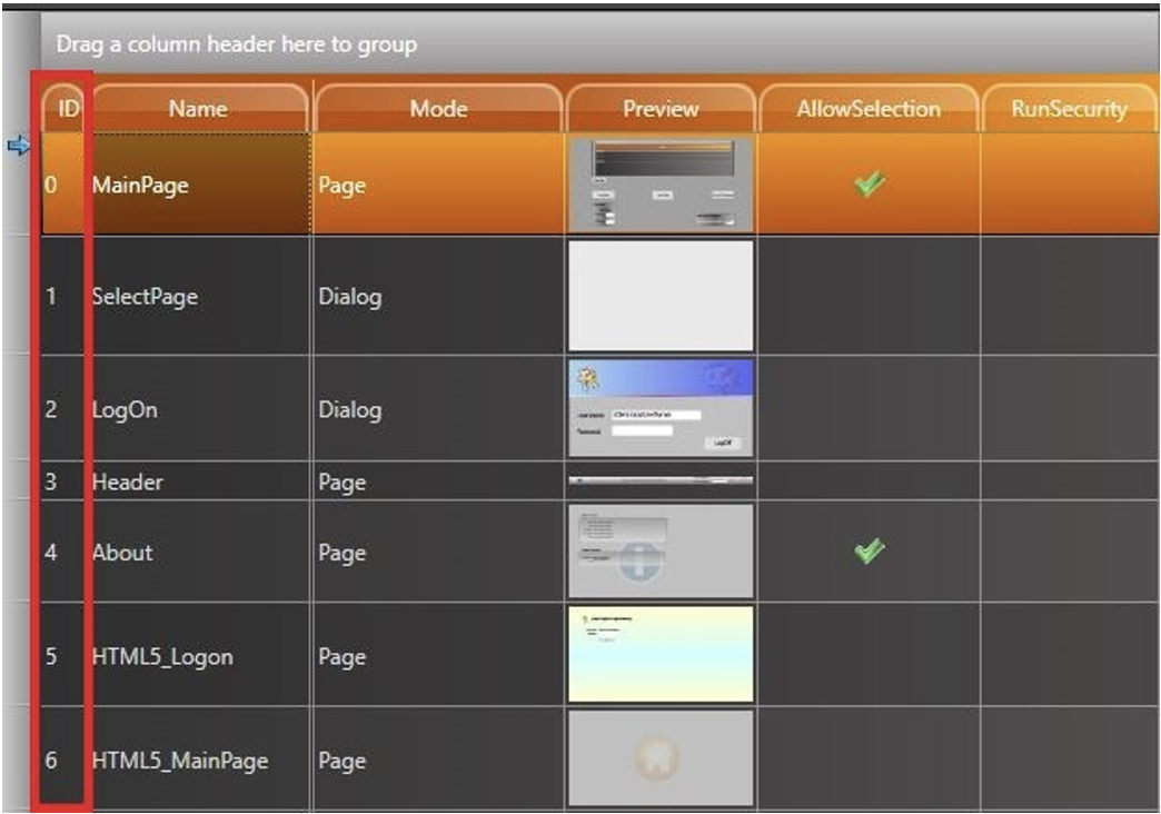
Id Object: Object ID (Internal Use). Can be found at Edit > Displays > Displays.
IsOpened: Indicates if the selected display is opened.
Returns false if is not opened
Returns true if is opened
Level: ReadOnly property with levels configured for the Display Object in Edit > Tags > Assets.
VerticalScroll: Indicates the vertical scroll value.
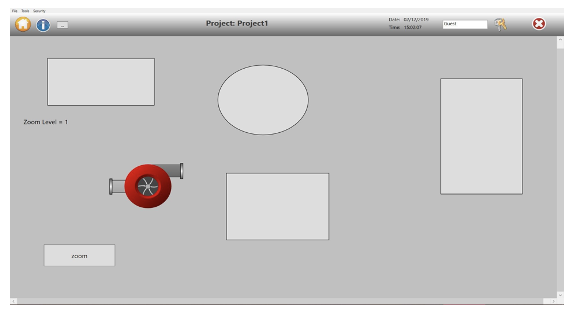
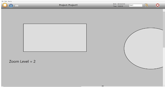
ZoomLevel: Indicates the zoom level of the page. One is the normal zoom level. See images to see a difference between zoom level 1 and 2.
Methods
Close()
Begin close display
Returns a flag indicating success (true) or fail (false)
Example
|
GetCustomPropertiesAsString(string sep)
Get all custom properties
Default Separator is ‘, ‘
Returns a string
Example
|
GetCustomPropertyValue(string PropertyName,string defaultValue):
Get value of custom property name
propertyName: Property Name
defaultValue: Default value if property could not be found
Returns property value
Example
|
NewPopup(object[] items):
Opens a new popup. If the Display is already open, a new instance will open
Always returns an empty string, independent if it succeeds or fails
Example
|
Open()
Begin open display
Returns a flag indicating success (true) or fail (false)
Example
|
OpenModal()
Open Display as modal
Disabled for Mono and HTML5
Returns a boolean indicating success (true) or fail (false)
Example
|
PrintDisplay(bool defaultPrinter)
Begin print display
Returns a boolean indicating success (true) or fail (false)
defaultPrinter: flag indicating whether default printer must be used or not
Example
|
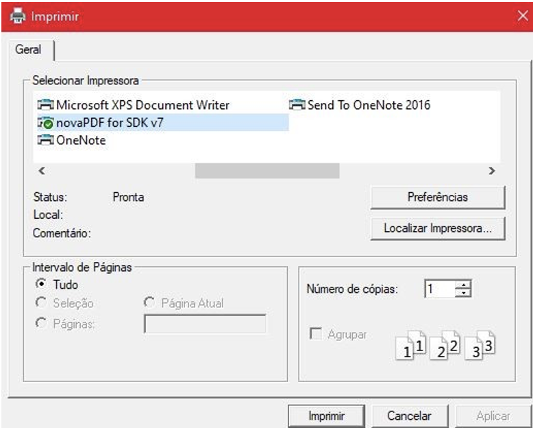
If the default printer is set to false, a popup window will appear.
PrintDisplayDefaultPrinter(int PageOrientation) :
Begin print display using default printer
PageOrientation: 0 for Portrait and 1 for Landscape
Returns a flag indicating success (true) or fail (false)
Example
|
RemoveAllCustomProperties():
Remove all custom properties
Returns always Not used
Example
|
SetCustomProperties(string str, string sep)
Set custom property. If property does not exist, it is created.
propertyName: Property Name. If the name starts with an ‘@’ and the rest of the string is a valid tag name, the property is a reference to the Tag Value.
propertyValue: Property value
Returns always Not used
Example
|
SetCustomPropertyValue(string propertyName, object propertyValue)
Set custom property. If the property does not exist, it is created.
propertyName: Property Name. If the name starts with an ‘@’ and the rest of the string is a valid tag name, the property is a reference to the Tag Value.
propertyValue: Property value.
Returns always Not used.
Example
|
Display runtime objects
The namespace Display lists all Displays with their properties and open and close methods.
The namespace Layout lists all layouts with their properties and open and close methods.
The namespace Client has the properties of the environment on each client computer or mobile device connected.
See http://www.spinengenharia.com.br/help/an-2014/runtime/index.html for the full programming reference on runtime objects.
| Panel | ||||||||||||||||
|---|---|---|---|---|---|---|---|---|---|---|---|---|---|---|---|---|
| Table of Contents | ||||||||||||||||
| maxLevel | 2 | |||||||||||||||
| minLevel | 1 | printable | ||||||||||||||
| Scroll ignore | ||||||||||||||||
| ||||||||||||||||
On this page: |